Monday, 23 March 2015
Research Into Similar Products - (Beyoncé Album Advert)
Beyoncé's Mrs Carter Tour began in April 2013 in Serbia and went on for many months.
The Mrs Carter Tour Advert was in basically every magazine and newspaper worldwide announcing the tour and new album of the international star.
The gold and black contrasts together to create a bold, extravagant illustration and the regal style of the image conveys the message that she is the queen of the stage, and a queen of pop.
Although the image of Beyoncé is quite over the top and bejewelled... The font is quite straightforward and easy to read.
The indirect address intrigues the reader and makes them want to find out more about the tour and upcoming album.
I think this tour advert found in OK magazine in December 2012 (after it was announced, with added dates) is a very good example of an effective album advert.
Thursday, 19 March 2015
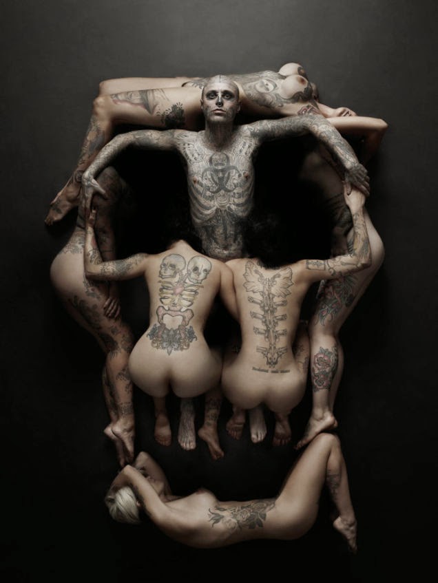
Drafting and Planning - Influence for Album Cover (DigiPak) - Dalí
Another thing that inspired me to set out my album cover this way was surrealist artist Salvador Dali's 'In Voluptas Mors' (Pleasure Within Death)
This image reminded me a lot of my front image and I used this as influence of moving my pieces around in a way to make it look like something else.
I didn't want my album cover to look similar to this completely, as it's not exactly the style I was looking for, but when I saw what I had created it reminded me of this,m so I enhanced certain bits lighter and darker.

(original)
(2014 recreation)

(Tattoo design)
This image reminded me a lot of my front image and I used this as influence of moving my pieces around in a way to make it look like something else.
I didn't want my album cover to look similar to this completely, as it's not exactly the style I was looking for, but when I saw what I had created it reminded me of this,m so I enhanced certain bits lighter and darker.

(original)
(2014 recreation)

(Tattoo design)
Tuesday, 17 March 2015
Organsiation - Influence for DigiPak (Drafting and Planning)
The original image I wanted to use for my Digipak was the 'broken glass heart' (below) that I found on Tumblr.
I liked this image as all of the songs on Sam Smith's album are about love and I wanted to convey the idea that a heart was easy to break, so portraying this through the use of broken glass in the shape of a heart would be effective.
When changing the effects of my original image on Microsoft Word, I noticed that the image in Black and White looked very effective and fit with all my other house style in my video, Digipak and magazine advert.
The artistic effects you can change on there inspired me to create my own 'broken glass heart' and I did this by marking out the shape of the heart and then filling it in with broken pieces.
Sunday, 15 March 2015
Drafting and Planning - Influence for DigiPak
During my research, I looked into the fonts used in the 1960s for posters, adverts etc. and these fonts were very popular and inspired me to add a more retro feel to my production.
Here is an example of the thing I saw:
Seeing this got me thinking about adding words into my image of a heart, in a hidden way. I have always liked the idea of hidden words and hidden meaning and this was a great opportunity for me to include it. I tried to keep the image of the broken glass heart relevant but by changing the shapes of the broken glass into letters spelling out 'Love Yourself' in the heart.
Here is an image of the heart I created which will now definitely be the standard for my digiPak album cover for my regeneration of Sam Smith's album 'Empty Words'
This is what I created:
Saturday, 7 March 2015
Drafting and Planning - Proposed Final Version of Music Video
This is a screenshot from MoviePlus showing the timeline of my music video in its entirety. All of the imported media including soundtrack, original footage and original photographs are in the pane on the right of the page, the timeline at the bottom shows the video track in the centre with the additional overlaying text captions, the photographs (from Flipagram influence) and also the soundtrack underneath.
I think MoviePlus is quite an easy program to use particularly as importing and cropping video bites is quite easy. Some challenges I overcame included that once a video is edited it can move around due to the saving pattern. When the file saves, the videos seem to compress somehow nd move away from their original alignment according to the specific time and section of song but hopefully this will be rectified when marking.
Also, MoviePlus is good as you can alter one part of video for another and add the same effects over the top such as cross-fade etc.
Sunday, 1 March 2015
Organisation - codes and conventions of music videos
Conventions of Music Videos
Camera Shots:
Music videos tend to include many long shots, close ups and mid shots. This is to create emphasis on the artist, location and emotions. Also, close ups are used not only to show emotions but to reflect the words of the song with the movement of the lips of the artist.
Camera Movement:
The movement of the camera is used to follow and trace the artist or band. Camera movements include tilts, pans, tracking and crane shots.
Mise-en-scene:
This refers to the arrangement of performers and props on stage or in a scene for a production of a music video or any other media text. Mise-en-scene puts importance on the representation of something. An example is, ‘Mad’ by Neyo. The mise-en scene involves him walking down a road alone, being in an isolated room. This reflects the isolation from his lover. Also, the props include hats and dark clothes which represent the down mood of the song. Similarly, the lighting is kept very dark as it is black and white; this connotes the angry and depressed mood. This is just one example of the mise en scene used to give an idea of how mise-en-scene works.
Neyo - Mad
http://www.youtube.com/watch?v=sAYuOc7_TKg&feature=fvst
Editing:
Jump cuts are the predominant editing technique used in music videos. This is because this allows a sudden change from one scene to another. Similarly, transitions such as fade and dissolve are very common in music videos as they create a different effect to cuts.
Other main conventions consist of:
Lighting:
Some music videos are black and white which help emphasise a particular mood and some videos have artificial lighting which put the artist/s in an enhanced look.
Sound:
Sound is mainly the vocals or the song but in some cases such as Michael Jackson – Thriller, the producers can make the music video into a short film.
Props:
These are a vital in aiding to add to the scene and create significance on particular objects or people.
Costume:
This goes with the scenes in the song and reflects the genre. Costume is an important factor because it has a slight influence on how the viewers will dress because they use some of the celebrities as role models
Colour:
Colours tend to set the mood of the song through creating an atmosphere. For example, dark colours are used more in rock songs such as Kings of Leon and bright colours are seen to be used more in hip hop and pop videos.
Music Conventions in Pop videos
•
Bright and colourful
•
Close ups to show the cheerful and upbeat emotions
•
Extreme close ups – these tend to show the purity and innocence in the personality of the artists
•
Aims at the teenage audience
•
Very upbeat
Examples:
•
Britney Spears http://www.youtube.com/watch?v=brYTO6JHMHs
•
Christina Aguilera http://www.youtube.com/watch?v=-2U0Ivkn2Ds
Subscribe to:
Comments (Atom)


